Website-Designing
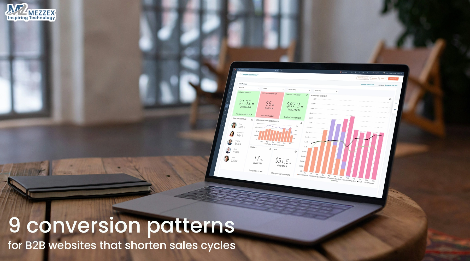
9 Conversion Patterns For B2B Websites That Shorten Sales Cycles
A buying team sits on a call with three vendors open in separate tabs. All offer similar features. Only one website shows clear value, simple paths, and an obvious next step. That vendor wins the deal. This is what strong conversion patterns do for B2B websites. The 9 Conversion Patterns For B2B Websites That Shorten Sales Cycles remove friction, answer key questions early, and move buyers from research to action faster. When you apply these patterns across your pages, your website supports shorter cycles, better-qualified conversations, and more confident decisions.
1. Outcome-first hero sections
- Lead with a clear business outcome, not a feature list, so visitors see value in seconds.
- Name your ideal buyer group, such as “B2B operations leaders”, “IT teams”, or “digital commerce managers”.
- Use one primary CTA that moves buyers forward, for example, “Book a strategy session” or “See how it works”.
- Add a secondary CTA for lower-intent visitors, such as “Explore use cases” or “View solution overview”.
- Explain in one short line how your solution changes their current state, so internal champions repeat that message inside their team.
- Make the hero simple enough that every stakeholder understands it without extra explanation, which reduces early clarification calls.
2. Self-serve product tours and interactive demos
- Offer an on-demand product tour that loads without a meeting, paywall, or long form.
- Use clickable flows, short videos, or guided screenshots that show core value, typical workflows, and outcomes in under five minutes.
- Place links to the tour in your hero, navigation, and high-intent pages so buyers never need to hunt for it.
- Let visitors copy or share the tour link easily, so champions present it to decision-makers without scheduling multiple live demos.
- Add a clear CTA next to the tour, such as “Ask a question” or “Talk to an expert”, for prospects who want to go deeper.
- Use the tour to answer common “how does this work?” questions upfront, so sales calls focus on fit, scope, and timing, not basic education.
3. Use-case and role-based paths
- Group your main navigation and homepage entry points around use cases or roles, not only product names.
- Create paths like “For Operations”, “For Finance”, “For IT”, and “For Ecommerce Teams” that reflect real buying groups.
- On each path, speak directly to that role’s pains, KPIs, and risks, then show targeted proof and relevant features.
- Repeat your main CTA on each path in that role’s language, for example, “Reduce manual work in your warehouse team” or “Cut integration effort for your IT team”.
- Show one or two quick proof points per role, such as time saved, errors reduced, or faster onboarding.
- Use these paths to help each stakeholder reach their own “yes” faster, which reduces internal debate and speeds full-committee approval.
4. Problem–solution blocks on key pages
- Structure your pages as repeated problem–solution blocks, so visitors can scan and find their specific pain fast.
- For each block, start with a short problem statement that your buyer recognises, such as “Manual order handling slows your team”.
- Follow with a direct solution line that shows what your product or service does to fix that problem.
- Add a simple impact metric or outcome where possible, such as “cut processing time by 30%” or “reduce support tickets by half”.
- End each block with a contextual CTA like “See this workflow in action”, “View a similar customer story”, or “Check typical timelines”.
- Use these blocks to remove uncertainty section by section, so buyers move through the page without switching to a competitor tab.
5. Micro case studies with metrics
- Swap long narrative case studies on top-level pages for short “micro stories” that buyers can scan in seconds.
- Follow a simple pattern: client type, starting situation, core change, and one clear metric (for example, “SaaS vendor reduces time-to-PO by 20%”).
- Place these micro stories next to CTAs, contact forms, and demo offers so they answer “Does this work for teams like ours?” at the point of action.
- Link to longer case studies for high-intent visitors who want more context, but let most buyers make progress with short snapshots.
- Cover key industries you target, such as logistics, finance, ecommerce, or healthcare, so multiple sectors see themselves in your proof.
- Use these metrics to remove common objections early and reduce the need for extra calls just to build trust.
6. Transparent process and timeline
- Show a clear 3–5-step process that covers the full journey from first contact to launch and optimisation.
- Name each step in simple terms, such as Discovery, Proposal, Build, Launch, and Optimise, so non-technical stakeholders follow easily.
- Under each step, state what your team does, what the client team does, and what the output is at that point.
- Add typical time frames for each stage, so buyers see how long a standard project or onboarding cycle takes.
- Place this process near your main CTAs and in key consideration pages, such as services, solutions, or implementation.
- Use this clarity to remove “what happens next?” anxiety, which often delays sign-off and stalls deals in the legal or procurement stage.
7. Tiered calls-to-action
- Offer multiple CTAs that match different levels of buyer readiness, instead of relying only on “Contact sales”.
- Use low-friction CTAs for early-stage visitors, such as “Download implementation checklist” or “Get integration overview”.
- Offer mid-intent CTAs for buyers who evaluate options, like “Estimate project scope” or “Share your technical brief”.
- Keep high-intent CTAs such as “Book a consultation” or “Schedule a live demo” visible on every important page.
- Make it clear what each action delivers, such as a 30-minute review, benchmark report, or tailored roadmap.
- Use engagement data from these CTAs to qualify leads better, so sales teams focus time on accounts closer to a decision and move them faster through the funnel.
8. Live assist and instant booking
- Add live chat or a smart chatbot that answers common buying questions in real time, especially on key decision pages.
- Set triggers to show chat on product, pricing, integration, and comparison pages where visitors often feel unsure.
- Embed a calendar widget near strong-intent sections and at the end of key flows, so prospects can book time directly with your team.
- Offer short, focused call types, such as “15-minute fit check” or “30-minute technical review”, to lower the barrier to booking.
- Route complex queries from chat into quick calls or follow-ups, so you resolve issues while interest is high.
- Use this live assist layer to turn stuck sessions into meetings without long email threads, which shortens the time from first visit to first meaningful conversation.
9. Trust blocks next to every form
- Place trust signals right next to your forms and “Book a call” buttons, not only on a separate testimonials page.
- Use client logos, short quotes, uptime or SLA notes, and simple security assurances to show reliability at a glance.
- Add one short line about whom the form is for, such as “For B2B teams planning a new platform in the next 3–6 months”, so visitors self-qualify.
- Keep your forms short and ask only for information your team uses in the next step, such as name, work email, company, and goal.
- Test different trust combinations and field sets to see which versions increase completion rates the most.
- Use these trust blocks to reduce last-minute hesitation at the exact point where visitors decide whether to share their details.
Start Applying These 9 Conversion Patterns
These 9 Conversion Patterns For B2B Websites That Shorten Sales Cycles work best when you apply them across your homepage, key service pages, and lead funnels. Review your current B2B website against each pattern and note where visitors slow down, request extra calls, or drop off. Then prioritise updates to your hero, CTAs, self-serve demos, and trust blocks. If you want support, speak with the Mezzex team about a practical review of your site and roadmap for applying these patterns. Email us at info@mezzex.com or call +44 121-6616357 to discuss your B2B website.
