Digital-Marketing
Identifying Exact Customer Drop Off Points On Your Website To Improve Conversions
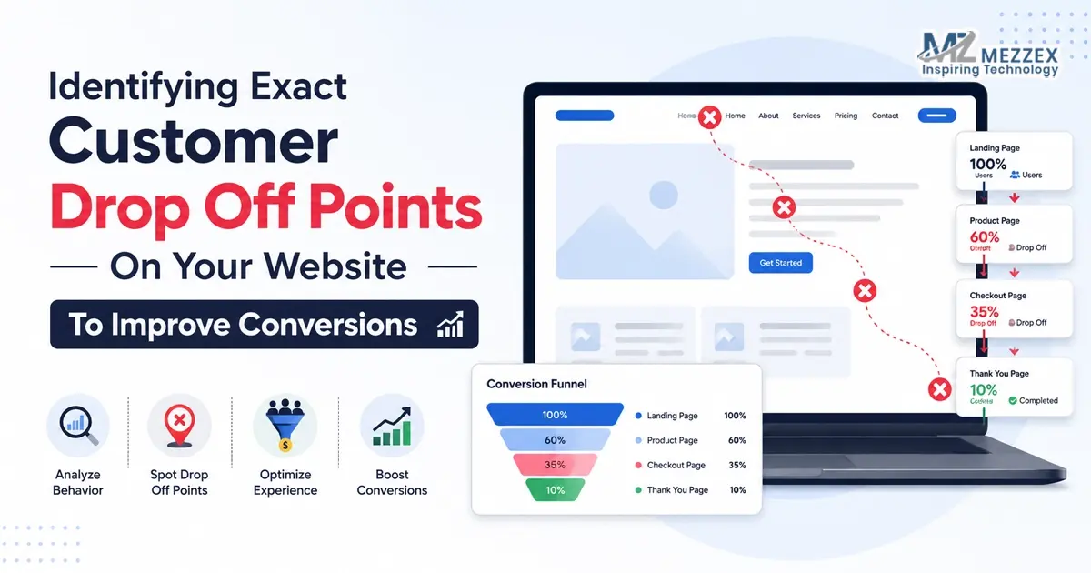
You post on social media, run campaigns, check analytics, and still see the same problem: people arrive, look around, and leave. The traffic exists. The action does not. That usually means the website loses visitors at a specific point: a slow page, a weak headline, a hidden button, a long form, a poor mobile layout, or a landing page that does not match the click. Identifying exact customer drop off points helps you stop guessing. It shows where the journey breaks, why visitors hesitate, and what needs to change to improve conversions.
Start With The Moment The Visitor Arrives
- Every visit starts with an expectation: A person who clicks from a social media post, search result, advert, or email arrives with a reason. The landing page needs to confirm that reason quickly. If the page feels unrelated, the visitor leaves before reading much.
- The first screen carries heavy weight: Users judge the page through the headline, visual, load speed, navigation, and main CTA. If they cannot understand the offer in a few seconds, the page creates doubt instead of momentum.
- A drop off point often appears before the form: Many websites focus on the final enquiry button, yet visitors often leave earlier. They may never reach the pricing section, proof section, product details, or contact option.
- Good conversion work starts with observation: The first task is not to redesign the page. It is to identify where people stop moving, pause for too long, click the wrong element, or leave the site.
Map The Journey Before You Change The Page
- Trace the route from source to action: Social media, paid ads, organic search, direct visits, and email links all bring users with different levels of intent. A visitor from a short social post needs faster context than someone who searches for a service directly.
- Name the intended action: A page needs one main goal. That may be an enquiry, call, booking, purchase, quote request, download, or form submission. If the page presents too many choices, users drift.
- Check the steps in order: A lead generation journey may move from campaign post to landing page, then to service details, proof, CTA, form, and confirmation. An ecommerce journey may move from product page to basket, delivery, payment, and confirmation.
- Look for the first break, not the loudest issue: A checkout problem matters, but users may drop earlier because the product page lacks delivery clarity. A form may look weak, but users may never reach it because the CTA sits too low.
Review The Pages Closest To Revenue First
- Commercial pages deserve priority: Service pages, product pages, pricing pages, contact pages, checkout pages, campaign landing pages, and lead forms usually affect conversions more than general content pages.
- High traffic does not always mean high value: A blog can attract many visitors and still sit far from purchase intent. A lower-traffic service page can matter more because the visitor already wants help.
- Exit rate needs interpretation: A user leaving after reading a blog answer can be normal. A user leaving after viewing pricing, delivery, booking details, or the contact page points towards a conversion issue.
- Social campaign pages need tight alignment: Mezzex focuses on social media strategy, content timing, creative campaigns, platform-specific activity, and performance insights. When social media sends users to a website, the page needs to continue the same message and guide the next step.
- The best question is simple: What does the visitor need at this page, and does the page make that action easy?
Use Behaviour Signals To Find Friction
- Analytics gives the first clues: Exit rate, bounce rate, engagement time, page path, conversion rate, and return visits show where users lose interest. These numbers do not give the full reason, but they show where to look.
- Scroll depth shows hidden information: If visitors leave before reaching the CTA, pricing, proof, delivery details, or form, the page may place key information too low.
- Click tracking shows confusion: Users may click images, icons, headings, menus, or blank areas because they expect those elements to do something. That behaviour often means the real CTA does not stand out.
- Form tracking reveals final hesitation: Form starts, abandoned fields, error messages, and failed submissions show where users lose patience. A form can lose a lead after the website has done most of the work.
- Segment traffic for clearer answers: Mobile users, desktop users, paid visitors, social users, organic users, and returning visitors often behave differently. Segmenting stops one average number from hiding the real issue.
Watch What Users Actually Do On The Page
- Heatmaps show attention patterns: They reveal where users click, how far they scroll, and which parts they ignore. This helps teams see if the page layout supports the intended action.
- Session recordings show the journey in motion: Recordings can show repeated scrolling, missed buttons, backtracking, rage clicks, menu confusion, or form hesitation. These moments give website teams practical evidence.
- Mobile behaviour needs its own review: A page can look clean on desktop and still feel hard to use on a phone. Small buttons, crowded text, slow images, sticky banners, or awkward forms can push users away.
- Repeated behaviour matters most: One strange session does not prove a problem. A pattern of users missing the same button, leaving at the same form field, or scrolling past the same CTA shows a real drop off point.
Find The Information Visitors Need Before They Act
- Unclear copy creates doubt: Visitors leave when the page does not explain what the business offers, who it helps, how the service works, and what happens after they make contact.
- Headings guide scanners: Many users skim before they commit. Headings need to help them find the offer, process, proof, price clues, contact route, and next step.
- Trust signals reduce hesitation: Reviews, case studies, accreditations, client logos, project examples, FAQs, team details, and clear contact information help users feel safer before acting.
- Objections need early answers: Cost, timescale, delivery, service area, process, quality, aftercare, and support often shape the decision. If the page avoids these points, users leave to compare elsewhere.
- CTAs need clear wording: Buttons such as “Submit” or “Learn More” often feel vague. “Request a Quote”, “Book a Call”, “Start Your Project”, or “Get Advice” tells the user what happens next.
Test Forms And Checkout Steps With Care
- Forms ask for effort and trust: Each field adds friction. A form that asks for too much too early can stop a user who already feels interested.
- Field order matters: Start with simple details before asking for larger commitments. A form that opens with too many personal or technical questions can feel heavy.
- Error messages need plain instructions: If the user enters a phone number, postcode, file, or email address incorrectly, the form needs to explain the fix without blame or confusion.
- Checkout pages need full clarity: Delivery costs, returns, payment options, stock status, account creation, and security signals all influence purchase confidence.
- The final step needs reassurance: Contact forms and checkout pages need response times, support details, privacy cues, or payment trust signals where relevant. The user needs to know what happens after the click.
Connect Social Media Traffic With Website Conversion
- Social media often creates quick interest: A person may click from a reel, story, advert, carousel, or profile link after seeing only a short message. The website needs to explain the next step fast.
- Message match keeps the journey intact: If the social post promotes a service, offer, product, or problem, the landing page needs to continue that same point. A mismatch feels jarring and reduces trust.
- Visual consistency helps users settle: Similar imagery, wording, offer details, and CTA language confirm that users have reached the right page.
- Performance insights need website context: Social media metrics show reach, engagement, and clicks. Website behaviour shows if those clicks lead to calls, enquiries, bookings, or sales.
- Both sides need to work together: Social media attracts attention. Website design decides how much of that attention turns into action.
Fix One Break Point Before You Redesign Everything
- A full rebuild is not always the answer: Some websites lose conversions because of a few specific issues, not because every page fails.
- Change one meaningful item first: This may include a clearer headline, stronger CTA, shorter form, faster mobile load, better proof section, cleaner navigation, or more direct landing page opening.
- Avoid changing too much at once: If the team changes layout, copy, form fields, images, CTA wording, and page speed together, it becomes harder to know what caused the improvement.
- Measure the result after each change: Track conversion rate, scroll depth, button clicks, form completion, call clicks, basket progress, and enquiry quality before moving to the next issue.
- Keep the process practical: Identify the barrier, fix it, review the result, and then move to the next point. That approach improves conversions without unnecessary disruption.
Design Around The Next Step
- Visual order should guide the user: Headings, sections, buttons, images, and proof points need a clear order. The visitor should understand where to look and what to do next.
- Mobile layout needs thumb-friendly actions: Key buttons, contact links, basket actions, and form fields need easy access on smaller screens. If the user struggles to tap or scroll, the page loses momentum.
- Proof needs to sit near decision points: Reviews, project results, delivery details, guarantees, service explanations, or FAQs often work best near CTAs, forms, product choices, and pricing sections.
- Speed supports confidence: Slow loading creates doubt before the page has a chance to sell. Fast, stable pages give users fewer reasons to leave.
- Conversion-focused design connects content and function: A page needs the right message, layout, speed, mobile experience, proof, and CTA to move the user towards action.
Turn Drop Off Points Into Better Decisions
- Customer drop off points give direction: They show where users hesitate, miss the next step, leave the page, abandon the form, or stop before checkout.
- Better conversion work comes from evidence: Analytics, heatmaps, recordings, form tracking, and campaign insights show what needs attention first.
- Small fixes can change the journey: A sharper headline, clearer CTA, shorter form, better mobile layout, stronger proof section, or faster page can improve the path to conversion.
- Website performance keeps changing: New social campaigns, devices, platforms, and user expectations affect how people move through a site.
- The best websites keep learning: Regular review helps businesses improve based on real behaviour, not assumptions or personal preference.
Book Website Design And Conversion Support With Mezzex
Book website design and conversion support with Mezzex to see where visitors lose interest and turn more traffic into enquiries, bookings and sales. Our team reviews page structure, mobile experience, forms, CTAs, campaign landing pages and social traffic journeys, then recommends focused improvements around real user behaviour. We connect website fixes with social media strategy, content planning, paid campaigns and performance insights, so every click has a clearer route to action. Speak to us at +44 121-6616357 about a focused website review today and plan practical changes that improve conversion rates without changing parts of your site that already work well right now.


: Pricing, Packages & SEO Rates")